Site Redesign and SEO Optimization
Main Navigation Menu Improvements
Before
The initial menu used by the client had several key issues. From a visual standpoint, the menu used yellow text on a white background, making it difficult to see due to a lack of contrast.
The menu was also too wide to fit on the screen, leaving some options not visible when first viewed. There was also too much space between items on the drop-down, also a visual handicap. Finally, some key items were missing from the menu, namely a Company section, along with Resources and there was an illogical grouping of menu options.
The goal was to provide a clear, clean source of navigation and a complete list of choices available on the site.

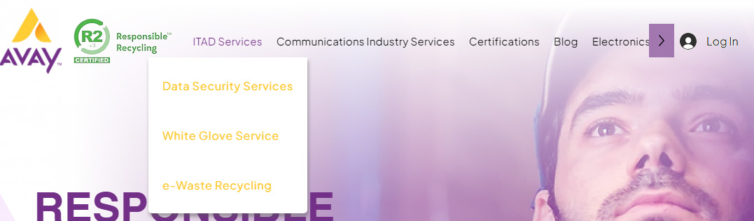
After
The revised navigation drop-down menu incorporated several changes to address the issues. First, the color scheme was revamped to a more standard and readable color. This revision provided enough visual contrast to make the menu easy to read.
Secondly, spacing was condensed to provide a more pleasing visual experience, also allowing for more menu items to fit into the available space. Titles were changed to better describe, in shortened titles, the products and services offered.
Finally, new menu options were added to allow for more content to be included, that better described what the client was offering. By horizontally shortening the space used, and by condensing vertically the spacing, MM delivered a more complete, visually pleasing set of menu options. Visitors can now see all options easily, and can quickly get to the desired content. MM also added new categories to the menu, such as a "Company", "Industry Resources", and we grouped categories more logically.