Welcome to Mastering Mobile Site Design
In today's digital age, where smartphones have become an extension of ourselves, mobile-first site design is no longer a luxury—it's a necessity. Here's why prioritizing mobile experience is critical for your online success, and you are losing business without addressing this need:
The Numbers Don't Lie
Mobile Usage is Dominant:
In January 2024, over 59% of people accessed the internet through mobile devices. Ignoring this majority means missing out on many potential customers, and today that number has only grown.
Google uses mobile-first indexing, meaning it primarily uses the mobile version of your website for ranking. A non-mobile-friendly site will struggle to rank well in search results. So, if you haven't updated your site recently, the chances are that you're not mobile-friendly!
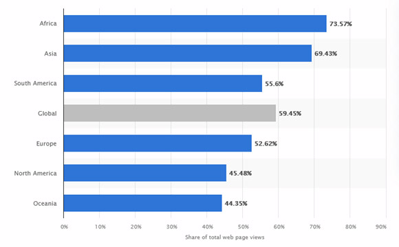
Source: Statistica 2025
User Experience is Key
Meeting User Expectations:
Mobile users expect seamless experiences. A site that's difficult to navigate or slow to load on mobile will lead to frustration and abandonment.
Optimizing for Touch:
Mobile-first design considers touchscreens, ensuring buttons are large enough and elements are spaced for easy interaction.
Speed is king:
Mobile users expect a site designed to load fast, so you must have a “different” version of your site for mobile, where images and general content is designed for speedy page loads.
Streamlined Development and Content
Focus on Essentials
Designing for mobile first forces you to prioritize content and features, resulting in a cleaner, more focused experience.
Scalability:
A well-designed mobile site can be easily scaled up for larger screens, saving development time and resources
SEO Benefits
Improved Rankings:
Mobile friendliness is a ranking factor. A mobile-first site is more likely to rank higher in search results, driving organic traffic. Without it, you are guaranteed to be losing traffic and revenue.
Lower Bounce Rates:
A positive mobile experience keeps users engaged, reducing bounce rates and signaling quality to search engines.
How to Succeed in a Mobile-First World; Performance Is King
Your site's Core Web Vitals (LCP, INP, CLS) play a major role in rankings. Focus on:
- Reducing load times to under 2.5 seconds.
- Compressing images and using next-gen formats like WebP.
- Minimizing JavaScript execution to improve speed.
If you hide critical information on mobile, Google will treat it as missing.
Optimize the User Experience (UX)
Mobile users expect sites to be intuitive. To meet their needs:
- Create thumb-friendly navigation with large tap targets.
- Maintain readable fonts with a minimum size of 16px (hint: the same size as the text in this newsletter).
- Avoid intrusive pop-ups that frustrate users.
Google even penalizes sites with poor mobile UX, so these steps aren't optional.
In Conclusion
Mobile-first design isn't just a trend; it's the standard for modern web development. By prioritizing mobile, you ensure a positive user experience, improve search engine visibility, and ultimately drive business growth. If you ignore it, money is being left on the table without question. Marcom Masters can help you by making your site mobile friendly.